This page contains three examples of exemplary usability test reports
Overview of this page
- An annotated usability test report
- Guidelines for useful and usable test reports
- A usability test report from CUE-10
- Another usability test report from CUE-10
An annotated usability test report
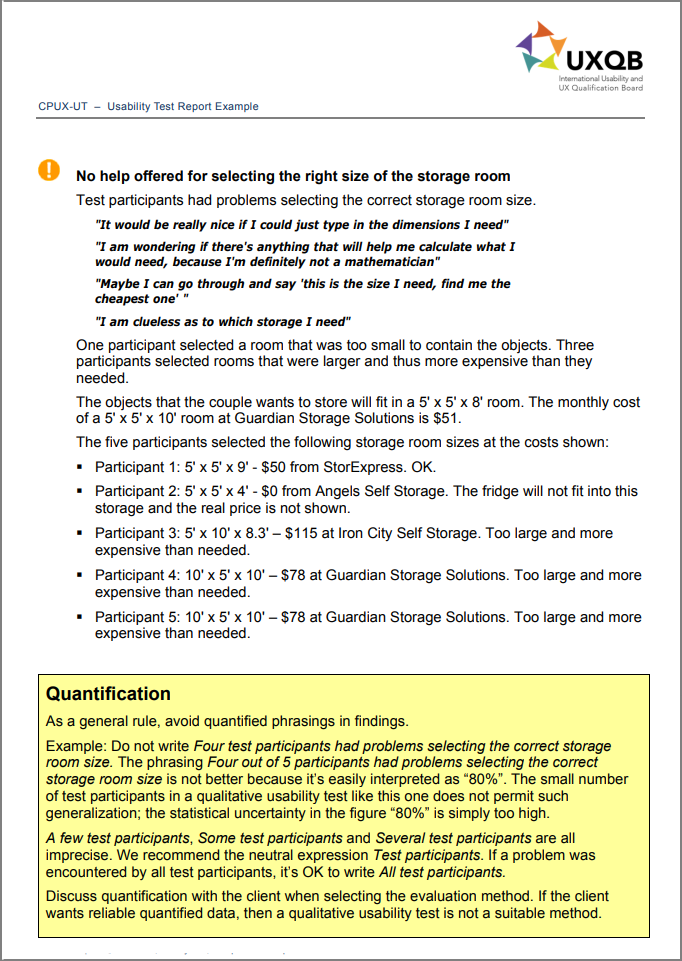
The sample usability test report is an example of how to document the findings of a qualitative usability test. It is intended to help usability testers produce better usability test reports. The report is an example of how to implement the rules in the section Useful and usable test reports below.
The sample usability test report is annotated. Boxes with a yellow background contain comments provided by the authors to the usability test report. Such comments are not included in a regular usability test report. The comments include rules of thumb and recommendations, for example with regard to how many findings should be included. The rules of thumb are based on the authors’ extensive experience and have been checked by other usability professionals.
The sample usability test report fulfills many of the requirements in the draft version of the standard
ISO/IEC DIS 25066 – Common Industry Format for Usability Evaluation Reports dated September 2014.
The sample usability test report does not include examples of all requirements in the ISO 25066 standard. It uses terms that are defined in the CPUX-F Curriculum and the CPUX-UT Curriculum. These curricula are available free of charge from UXQB’s website.
Guidelines for useful and usable test reports
I believe that usability professionals must set a good example to the world by creating highly useful and usable test reports.
I recommend that a usability test report should be limited to at most 25 usability findings and 25 pages (including appendices), and that it should include:
- a one-page executive summary placed at the very beginning of the report;
- a short and succinct description of each usability finding;
- findings that are based on what usability test participants did, rather than findings from a usability inspection;
- succinct and actionable recommendations;
- positive findings;
- appropriate user quotes;
- classification of usability findings by easily distinguishable, colorful icons that make it simple to skim the report for important issues.
According to the CUE studies not all of these features are self-evident in professional usability test reports.
Usability test reports should be consistent, for example, two reports written by the same person or by the same company should have the same format.
A usability test report from CUE-10
Several of the anonymous usability test reports from the CUE-studies are great examples of how to write a usability test report.
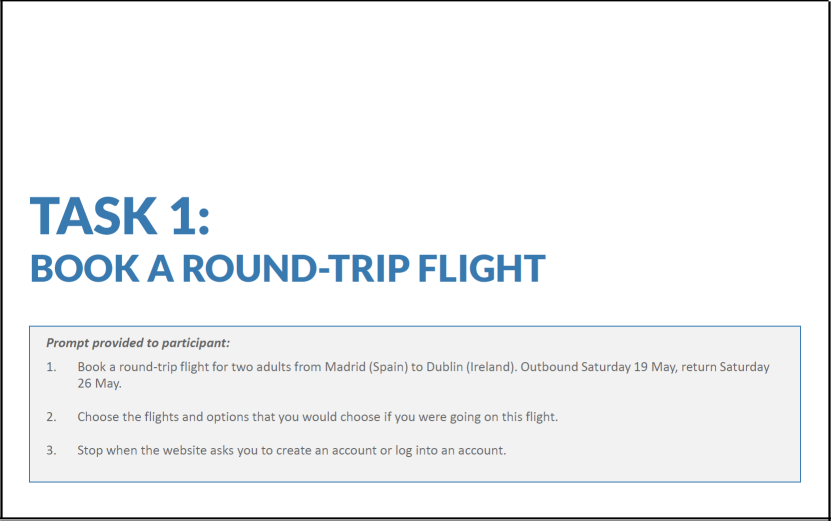
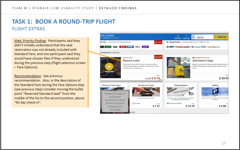
Here are two sample pages from the report written by Thanh Nguyen for the CUE-10 study:
I like
- the clear inclusion of the prompt provided to the test participant;
- the use of screenshots, which make the report more interesting;
- callouts to show where the problem is;
- recommendations for solving the problem.
Another usability test report from CUE-10
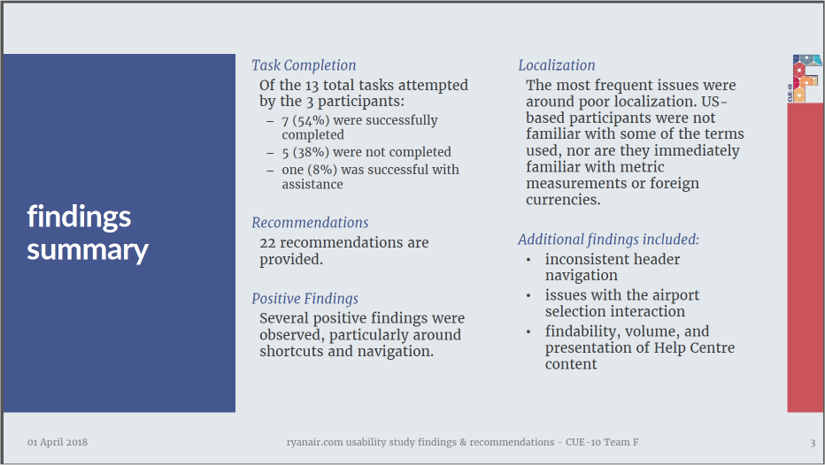
Here are three sample pages from the report written by Danielle Cooley for the CUE-10 study:
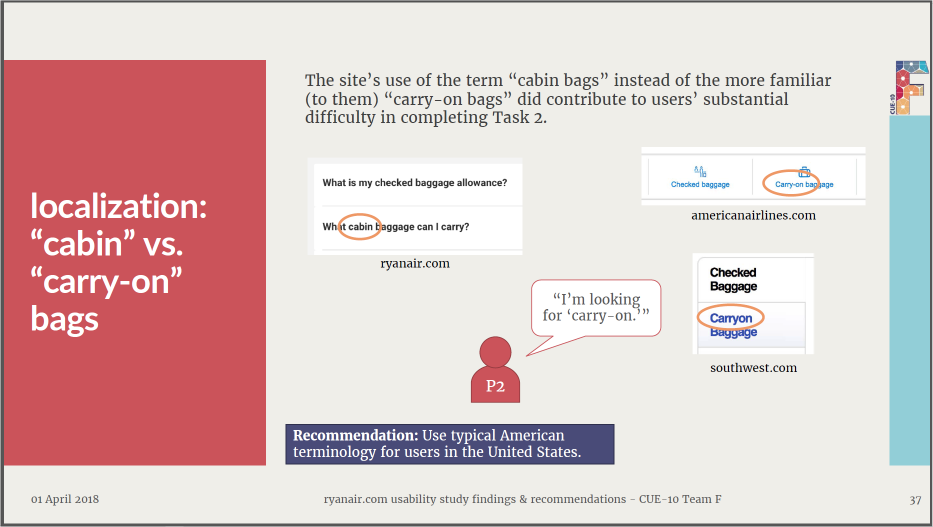
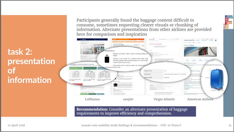
I like
- the findings summary (executive summary), which appears prominently on page 3 of the report;
- the comic-strip-like presentation of test participant quotes;
- magnifications of the critical parts of the screens;
- the prominent presentation of recommendations.